

Updates to RoundTable's Visual Identity
RoundTable Has a New Look
Our redesign is fresher and more accessible, but rest assured: nothing about your IT services or support has changed.
Why did we rebrand?
Our brand evolution is all about you!
After 16 years of serving nonprofits, RoundTable has grown, and we wanted our look and our language to reflect that. We’ve refreshed our identity to match the energy of our team and honor the incredible organizations we partner with. Above all, we’re dedicated to helping nonprofits leverage technology to drive their missions forward, in a way that’s clear, approachable, and fun!
%20(2880%20x%201800%20px).png?width=2000&height=1250&name=The%20Proven%20Process%20(Smaller%20File)%20(2880%20x%201800%20px).png)
What did we change?
The most noticeable shift is our visual identity. We moved away from traditional corporate tech blues and greens (colors that felt rigid rather than vibrant and innovative) to better reflect who we really are: diverse experts with a unique flair.
Alongside our updated logo, colors, and typography, we introduced retro pixel art. The name "RoundTable" has always brought to mind King Arthur’s knights, so this art style pays homage to those roots while tapping into nostalgic early tech games. We hope these changes, while drastic, feel like a nod to the past with an exciting vision for the future for our current and soon-to-be members. Business technology is often seen as dry, and we’re here to bring the fun back!
What does the new branding represent?
Our new branding doesn’t necessarily represent a shift in RoundTable, but rather an update to reflect who we really are after over a decade of growth and change.
The rebrand is an accumulation of feedback we’ve been given over the years, nonprofits we’ve been inspired by, and the work we continue to do. Yes, RoundTable is an IT company, but at our core we are people who care about nonprofit work and community impacts. Our changes were made with nonprofit realities in mind: your needs, your work, and your day-to-day realities.
What did the rebrand process look like?
Standing in the room at NTEN’s Nonprofit Technology Conference (NTC) 2026, we were struck by a sea of sameness. Standard corporate blues, greens, and cold messaging filled the floor. It was an “ah-huh” moment; we suddenly realized we looked like every other tech vendor in the room. We were reflecting a traditional industry rather than the energetic people and organizations we serve.
Above all, honesty and transparency have been a large part of our culture at RoundTable, both internally and externally. We aren't just another technology vendor, so why should our brand look like one?
That realization sparked immediate action. We partnered with experts from Big Duck to build a brand strategy that truly represents our community. Over several months of intensive research and countless all-day workshops, we audited nonprofit design trends, gathered feedback from our internal teams, surveyed our member base, and prioritized accessibility every step of the way.
Every detail was designed with intention. This isn’t a whole new RoundTable; it’s an evolution made for our staff and members.
Who are Jeff and Burnie?
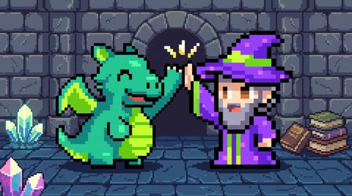
Our rebrand comes with two exciting new characters, named by our employees in a company-wide bracket competition! Meet Jeff, the wizard of technology spearheading projects to drive your impact forward, and Burnie, the dragon forging through the kingdom to lead tech advancements. Together, this dynamic duo will take us on an epic journey to slay scammers and keep your organization secure!
Want to share your thoughts?
We built this new look with you in mind, and we’d love to know what you think! Whether you’re loving the pixel art or just want to chat about what’s next for RoundTable, your perspective helps us keep growing.